The Art of Feeling Small
2023
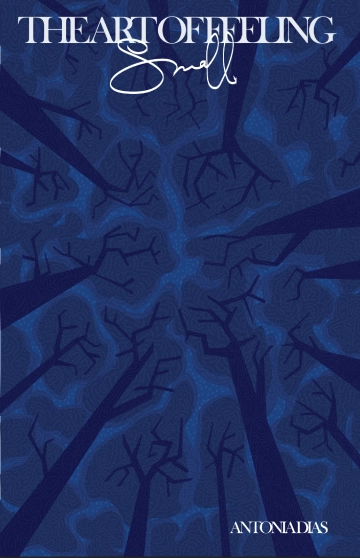
In the cover for my Zine, “The Art of Feeling Small”, I wanted to encapsulate the both abstract and very human sensation of feeling small. I did this by recreating a forest night sky, but with non realistic, geometric shapes and hand-drawn texture. I hoped to draw people in to the image, and get just a taste of the emotion the rest of the zine was aimed at invoking.
Icon Project - Jessica Helfand
2023
In my icon, I wanted to include the contrasting modern and organic elements that Helfand uses in her work, as well as making a reference to Design Observer. I included layers of half circles for an abstract, modern feel, although I kept it hand-drawn to maintain a look of authenticity. Also, I included a web/cell-like series of lines at the bottom half of the circle to mirror some of the organic designs Helfand has produced. I also liked this inclusion in my work because the web can represent connection and dialogue, both things that Helfand values and fosters. Lastly, the icon itself is a circle broken in half; the circle and the line going through it create the letters O and D, the initials for Design Observer.
The Feed Website
2023
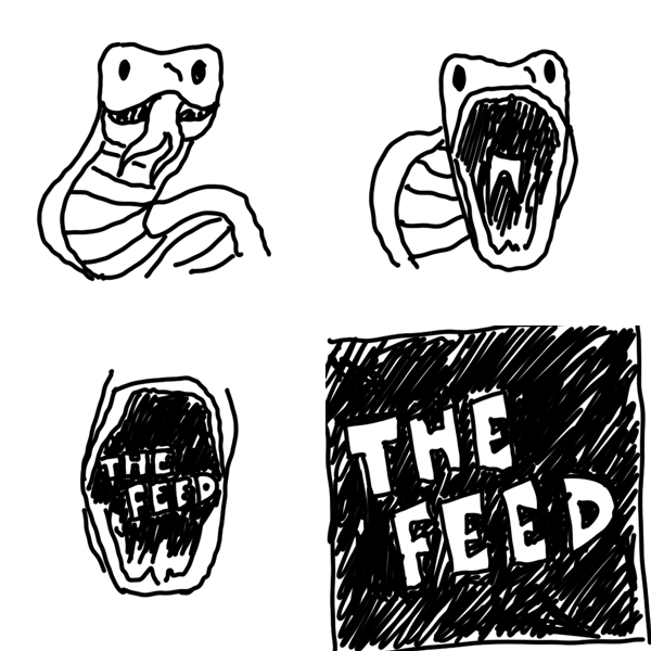
The Feed website is a mock social media site made from scratch with HTML and CSS. I gathered screenshots of my entire digital use/presence for a day, and presented them in a social media like "feed".
Click on the snake!
Walbaum Fraktur Poster
2023
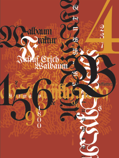
This typography project was made to demonstrate a font's use in its entirety. This poster features a full specimen of Walbaum Fraktur, along with presenting them in a way that embodies the values and practices of the style while references more contemporary uses of the blackletter.
Baskerville Poster
2023
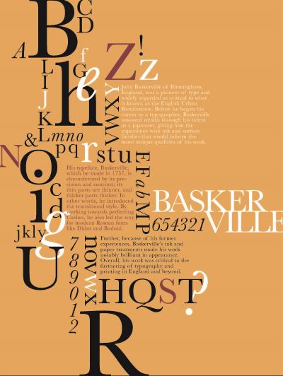
This typography project was made to demonstrate a font's use in its entirety. This poster features a full specimen of Baskerville, presented in a way that honors the style of John Baskerville while experimenting with form and grouping.
"John Baskerville of Birmingham, England, was a pioneer of type and widely regarded as critical to what is known as the English Urban Renaissance. Before he began his career as a typographer, Baskerville amassed wealth through his talent as a japanner, giving him the experience with ink and surface finishes that would inform the more unique qualities of his work. His typeface, Baskerville, which he made in 1757, is characterized by its precision and contrast; its thin parts are thinner, and thicker parts thicker. In other words, he introduced the transitional style. By working towards perfecting Caslon, he also led the way for modern Roman fonts like Didot and Bodoni. Further, because of his former experiences, Baskerville’s ink and paper treatments made his work notably brilliant in appearance. Overall, his work was critical to the furthering of typography and printing in England."
Franklin Gothic Poster
2023
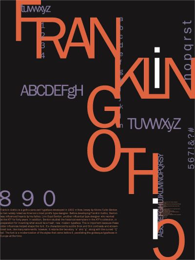
This typography project was made to demonstrate a font's use in its entirety. This poster features a full specimen of Franklin Gothic, and explores the its modern, streamlined look in contructing a typographic form.
"Franklin Gothic is a gothic sans serif typeface developed in 1902 in New Jersey by Morris Fuller Benton, a man widely noted as America’s most prolific type designer. Before developing Franklin Gothic, Benton was influenced heavily by his father, Linn Boyd Benton, another influential type designer who worked at the ATF for forty years. In addition, Benton studied the historical exemplars in the ATF’s collection, in preparation for inventing what would be a fresh, new, modern typeface. This is important because these older influences helped shape the font. It’s characterized by subtle thick and thin contrasts and streamlined look, like many sans-serifs; however, it retains the two-story “a” and “g”, along with the curved “Q” tail. The font is a modernization of the styles that came before it, paralleling the grotesque typefaces in Europe at the time."
Awe Spread #2
2023
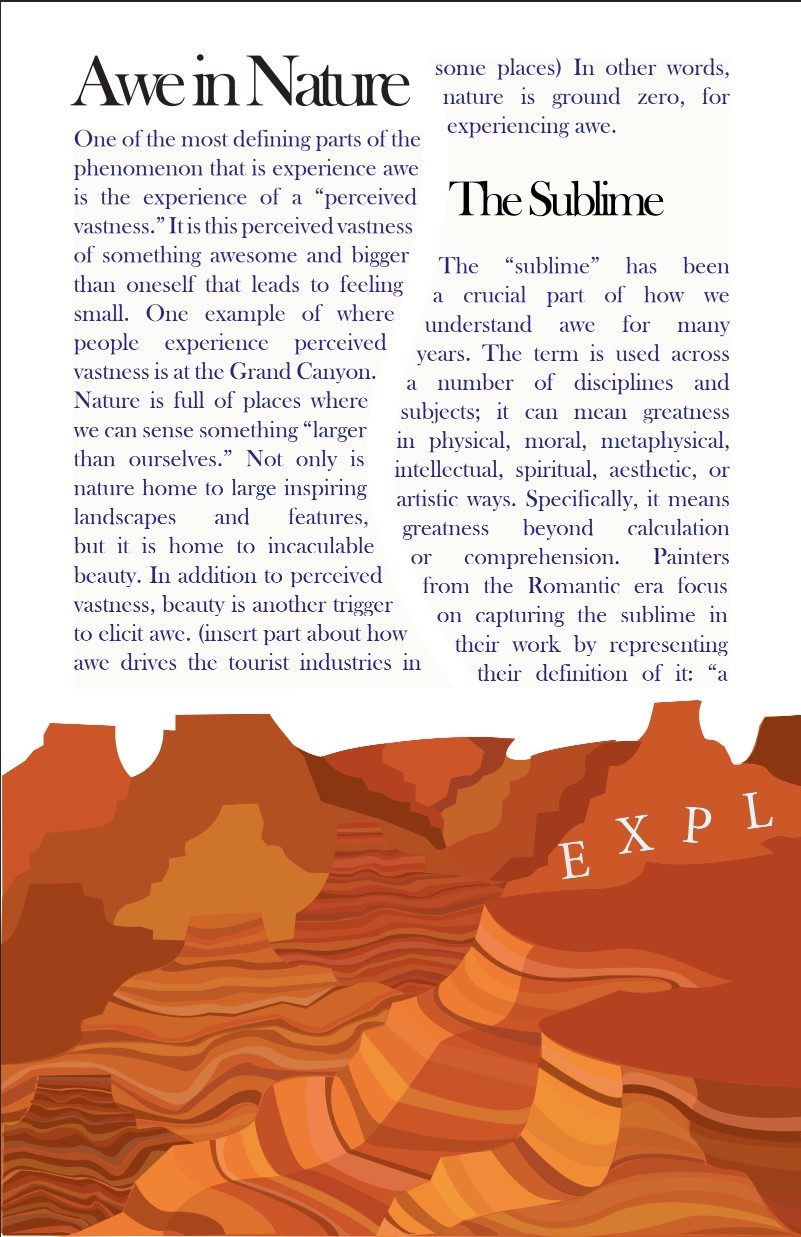
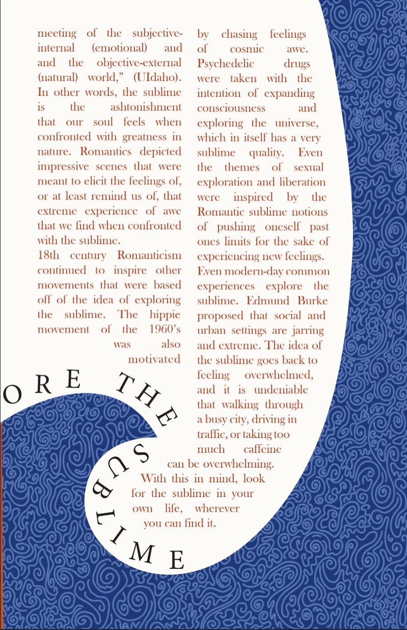
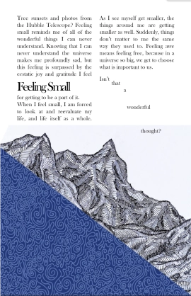
These select spreads from my Zine, “The Art of Feeling Small”, show my desire to integrate the design with the actual content of the text. With more hand drawn, natural scenes, I used the depth in these scenes to mimic the depth of the point the writing was trying to make. Also, I gave the paragraphs more fluid outlines, which was also done to imitate the movement of nature. All images and textures were drawn originally on Adobe Illustrator.
Awe Spread #1
2023
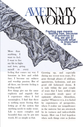
This first spread of my Zine includes old pen work and new design work. Here, I write about the feeling of awe and how inspiring it is, while also experimenting with page layout and textures.
